Real Lessons from Real Mistakes

Battle Scars

The $720K Tuition for My Product Management MBA

Look, I could tell you about all the things I did right at my startup. How we were first-to-market. How we got SOC2 certified. How we signed customers representing $1M ARR.

But you didn't come here to hear me brag.

You came here because you're probably making some of the same mistakes I made. And unlike a lot of consultants who learned product management from Medium articles and bootcamps, I learned it by watching what happens when you get it wrong.

Here are three mistakes that hurt the most. Not because I was lazy or stupid, but because I was convinced I was right.

(Spoiler: I wasn't.)

Battle Scar #1: "Our Modern Stack Will Blow Their Minds!"

(It Did. Just Not in a Good Way.)
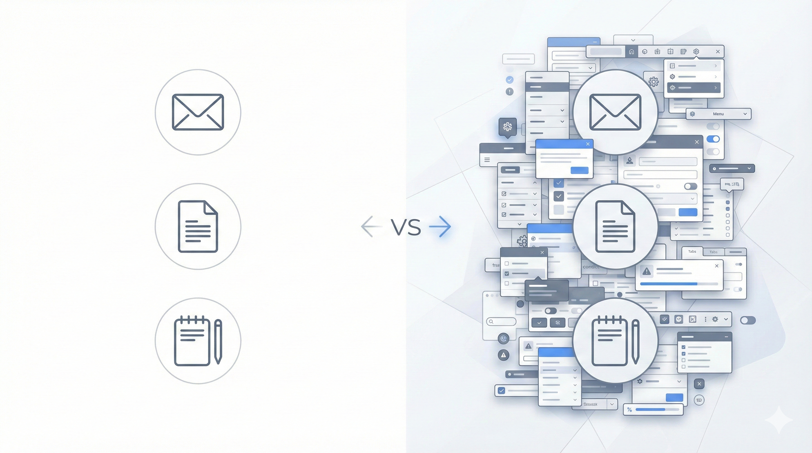
Comparison illustration showing simple separate tools versus complex overwhelming interface

The Mistake:

We built our product with what we thought was a powerful, feature-rich interface. Lots of options. Tons of functionality. Everything a user could possibly need, all accessible from the main screen.

We were so proud.

Our competitors? Users were just using Outlook to email clients, jumping into their CRM to add notes, copying and pasting from Word docs. Manual, disconnected processes.

We were going to show financial professionals what a real professional application looked like—everything integrated, all in one place.

You know, with menus, and sub-menus, and settings, and customization options, and...

What Actually Happened:

They took one look and said "this is too complicated."

Then they went back to their Outlook emails and CRM.

Why:

Because I fundamentally misunderstood the most important equation in product adoption:

Friction of Change > Friction of Current Solution

It doesn't matter if your solution is 10x more powerful. If learning your new way is harder than tolerating their old way, they won't switch.

Their manual process was annoying. But it was familiar annoying. They knew where everything was. Email in Outlook. Notes in their CRM. Copy/paste from Word. They had muscle memory. They'd built workflows around it.

Our "professional" integrated app required them to:

  • Learn where everything was in our interface
  • Figure out which of the 47 buttons they actually needed
  • Change their existing workflow
  • Trust that our way was actually better (risk)
  • Invest time upfront with no guaranteed payoff

We thought "more features visible = more powerful."
They saw "more stuff on screen = overwhelming."

The Real Kicker:

I kept hearing "this is great, but I just don't have time to learn it right now."

Translation: "The juice isn't worth the squeeze."

I thought they meant they were too busy this week. What they actually meant was: "I'm never switching unless you make this SO EASY that I can't say no."

I was defending our design by saying "but look at all the things you can do!"

They didn't care about all the things. They cared about doing ONE thing without thinking.

What I'd Do Differently:

Instead of building the "powerful professional" interface with everything visible, I would've built the "stupidly simple" interface that hides everything except the one thing they came to do.

Match their existing mental model. Make it feel like their familiar tools (Outlook, their CRM) but with one superpower. Let them ease into additional features instead of forcing them to navigate all of them from day one.

Strip away every button, menu, and option that isn't critical to the core workflow. Make the main screen almost empty—just the one action they need.

Lesson:

Your job isn't to build something powerful-looking. It's to build something that reduces TOTAL friction—including the friction of switching. Sometimes that means your UI should be almost boring in its simplicity, not impressive in its capability. Users don't want to see power—they want to feel like the app reads their mind.
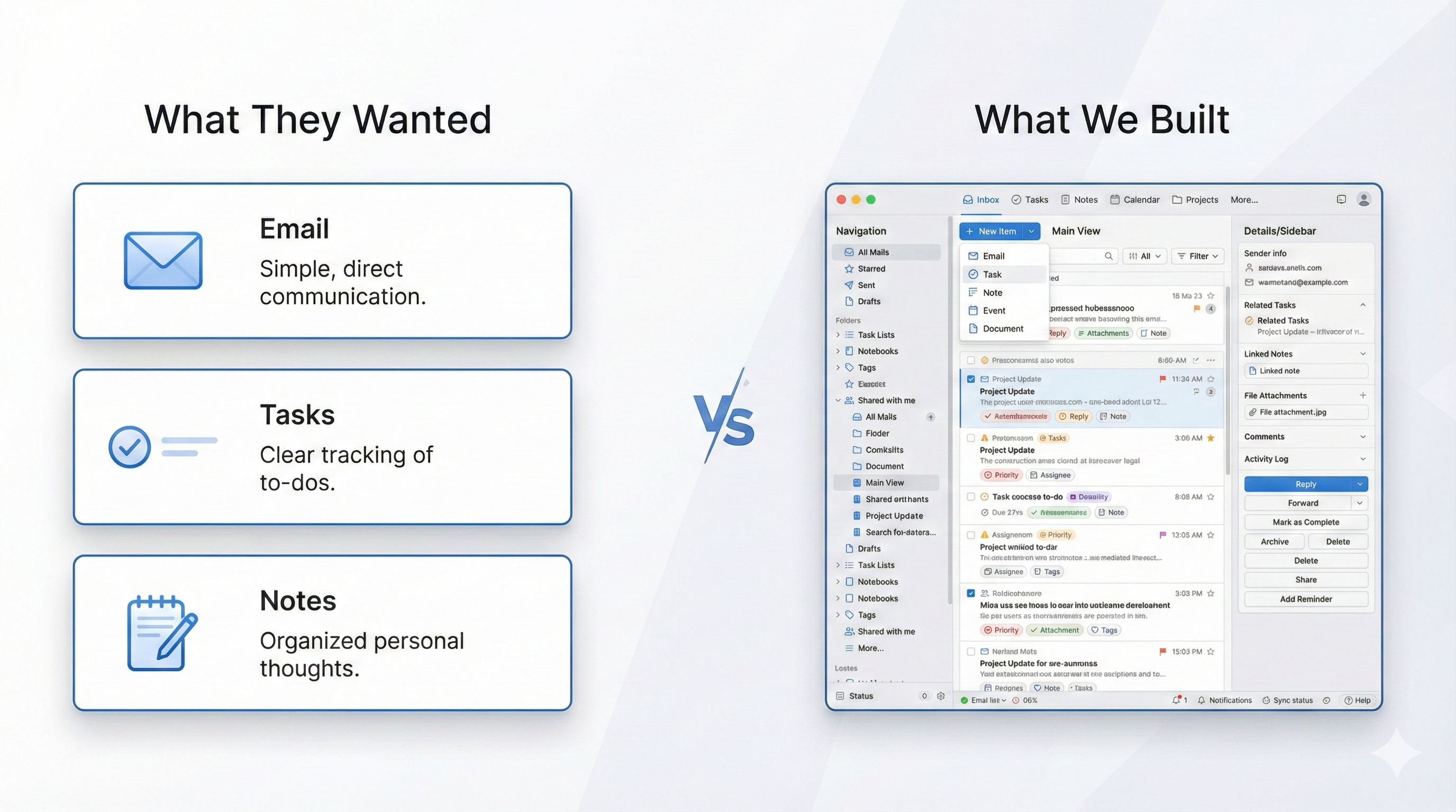
Battle Scar #2: "One Interface to Rule Them All!"

(Turns Out, People Like Their Separate Tools.)

Swiss Army knife metaphor showing consolidated complexity versus simple separate tools

The Mistake:

We built the complete workflow: meeting prep → notes during meeting → post-meeting follow-up. All in one interface.

And we were so proud of it.

Instead of users jumping between their CRM, email, and note-taking apps, they could do EVERYTHING from our platform:

  • Add notes
  • Email clients using our templates
  • Create tasks in their CRM
  • Customize their own templates
  • Manage everything from one place

We thought: "Why would anyone want to use 3 different tools when they can do it all here?"

What Actually Happened:

Our power users (about 10%) LOVED it. They customized everything, built their own templates, and used every integration.

The other 90% took one look, got confused, and went back to doing things the way they always had:

  • Write email in Gmail
  • Jump to CRM to create task
  • Done

Why:

Because we made two fatal mistakes:

Mistake 1: We combined actions that users did separately.

Users were used to:

  1. Write email (in email app)
  2. Create task (in CRM)

We built: "Write email AND create task from same screen using our powerful template system!"

Sounds better, right?

Wrong.

They didn't think "wow, this saves time!"

They thought "wait, how do I just send an email? Where do I create the task? Which template do I use? What are all these buttons?"

Mistake 2: We made the templates "powerful" instead of simple.

Every professional worked differently. So we built customizable templates thinking "everyone can make it work their way!"

But customization requires learning. And configuration. And decisions.

It was easier for them to just... write an email in Gmail. They knew how Gmail worked.

The Real Kicker:

They kept asking: "Can I manage my CRM tasks from your app too?"

We'd proudly say: "You can CREATE tasks and they sync to your CRM!"

They'd say: "But I want to manage them here."

I thought they wanted more features. What they actually wanted was for us to BE their CRM.

We were trying to be the bridge between tools. They wanted us to BE the tool.

But we couldn't build a full CRM. So we built this weird hybrid that was too complex for simple needs and not powerful enough for power users.

What I'd Do Differently:

Pick ONE job and do it perfectly.

Instead of "complete workflow in one interface," I'd build:

Option A: Just the meeting notes. Dead simple. No CRM integration needed. Export to email when done.

OR

Option B: Just the post-meeting email. Pre-built templates (not customizable). One click to send.

Let them use their CRM for CRM stuff. Let them use email for email stuff.

Stop trying to replace their entire workflow. Just solve ONE painful step so well that it's faster than their current way.

Lesson:

Users don't want "one interface for everything." They want one tool that solves one problem better than anything else. Consolidating multiple workflows sounds like a benefit, but it's actually confusion. Do one thing so simply that adoption is effortless, not five things with a learning curve.

Battle Scar #3: "Just Watch the Tutorial Videos!"

(Narrator: They Did Not Watch the Tutorial Videos.)

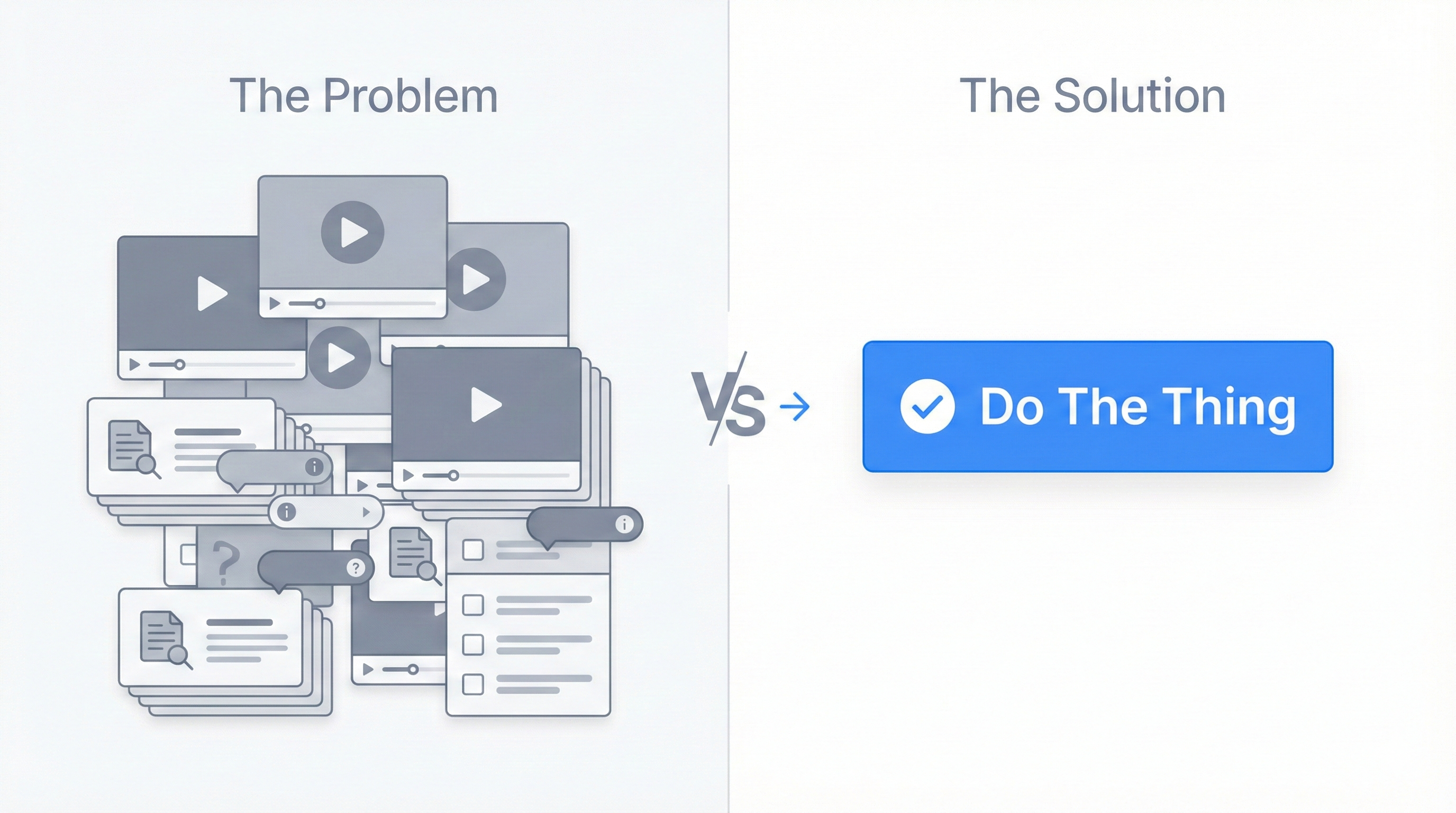
Illustration of unwatched tutorial videos versus single clear action button

The Mistake:

We spent MONTHS creating onboarding materials. And I mean a LOT of them:

  • Multiple tutorial videos (probably should've been a red flag)
  • Step-by-step help articles
  • Interactive product tours
  • In-app tooltips everywhere
  • A "Getting Started" checklist

I was so proud of our onboarding system. Everything a user could possibly need to learn the product was right there!

And when users would get confused, I'd think: "Just watch the videos! It's all explained!"

What Actually Happened:

I introduced analytics to track what users were actually doing. To see if they were using our help resources.

The data was brutal:

Almost nobody watched the videos.
Almost nobody read the help articles.
Most users clicked through product tours as fast as possible to make them go away.

Then they'd get stuck, get frustrated, and leave.

Why:

Because users don't want to learn your product.

They want to get their job done.

Nobody wakes up thinking "I'm so excited to watch tutorial videos about meeting notes software today!"

They log in thinking "I need to send this follow-up email by 2pm."

If your product requires homework before they can do the thing they came to do, they won't do the homework. They'll just leave.

The Real Kicker:

When I looked at the analytics and saw that nobody was watching our carefully crafted tutorials, my first thought was: "They just didn't take the time to learn it properly!"

No, dude. They took plenty of time. They gave you 5 minutes. That's a lifetime in SaaS.

If you can't deliver value in 5 minutes without a tutorial, your product is too complicated.

The fact that we NEEDED multiple tutorial videos was the warning sign. Not that users weren't watching them—that we thought we needed that many in the first place.

What I'd Do Differently:

Make the first experience immediately valuable with ZERO tutorials.

  • Let them create something useful in under 2 minutes
  • Show value before asking for any investment of time
  • Teach features progressively as they need them (not all upfront)
  • Design workflows so obvious that tooltips aren't necessary

If I'm creating tutorial videos to explain basic workflows, that means the workflows are broken. Fix the workflows, not the documentation.

Example: Our meeting recorder feature had the highest adoption because users could:

  1. Click "Record"
  2. Have meeting
  3. Get automatic notes

No tutorial needed. Value in under 30 seconds.

Lesson:

If your product requires tutorials to be useful, it's not a user problem—it's a product problem. The number of tutorial videos you're creating is inversely proportional to how good your UX is. Users shouldn't need to "learn" your app. They should be able to use it immediately. Every minute of required learning is a minute you're asking them to invest with no guaranteed return.

The Pattern

Notice the theme?

In every case, I was optimizing for what I THOUGHT users wanted instead of what they ACTUALLY needed.

I was building for the user in my head, not the user in front of me.

And it left $720K in revenue on the table—that's the difference between the $1M ARR we signed and the $280K we actually achieved.

So Why Should You Hire Me?

Because I've made every mistake in the book and learned what actually works.

I spent 5 years learning these lessons through painful trial and error. You can learn them in a 1-week sprint for $2,500.

Your choice.